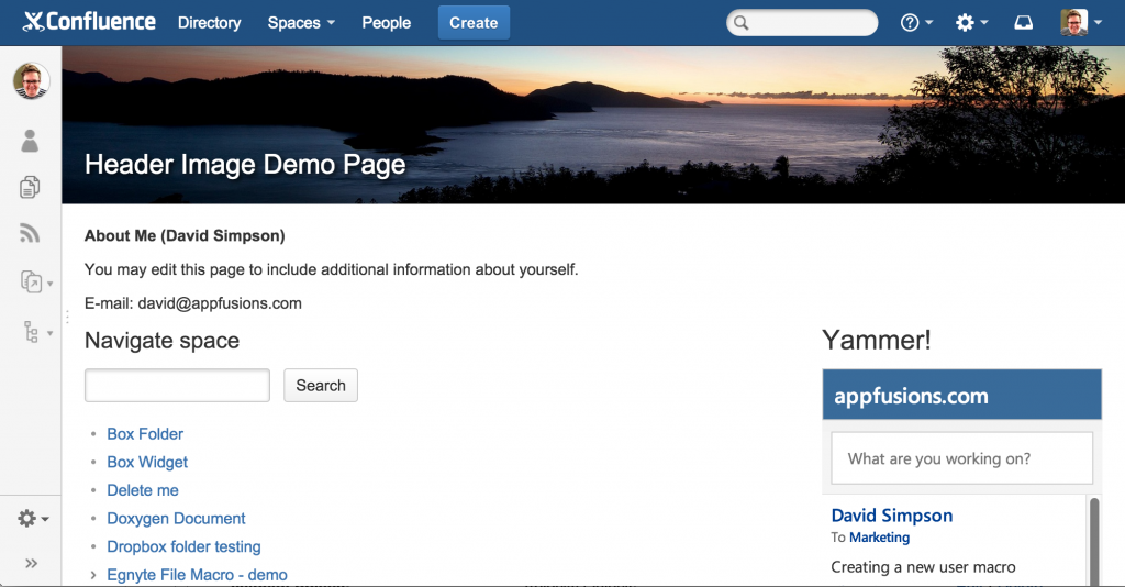
Header photos are all the rage (as my mother might say). Twitter has them. So does Facebook. Yup, even LinkedIn has them.
Confluence is a great platform for documentation, but what if you want to add extra some flare to your pages? Would a custom header photo be a good idea? Maybe so.
This post gives a simple method to do just that for pages that use the Default Theme.
In Confluence Admin | Configuration | User Macros create a new user macro:
## Macro: header-photo
## Author: David Simpson
##
## @param Photo:title=Header Photo|type=enum|enumValues=akabilk,captain_oblivion,rikpiks,renateflynn,grotan|default=red|desc=Choose a photo from one of these Flickr users
##
<script>
  AJS.toInit(function($){
    $('body').addClass('header-photo photo-${paramPhoto}');
  });
</script>
This gives you a user macro with some options to swap the background image between these images:
[gallery ids="3086,3082,3084,3085,3083"]
In Confluence Admin | Look and Feel | Stylesheet add the following:
/**
 *  Uses the {header-photo} user macro to trigger the styles:
 */
.header-photo #main-header {
	margin: -20px;
	padding: 20px;
	background: #69c;
}
.header-photo #title-text {
	padding-top: 40px
}
.header-photo #breadcrumbs a,
.header-photo #title-text a,
.header-photo .page-metadata,
.header-photo .page-metadata ul li a {
	color: #fff;
	text-shadow: 2px 2px 5px #000;
}
/*** Hide these until mouseover/hover ***/
.header-photo #page-metadata-banner,
.header-photo #breadcrumbs,
.header-photo #navigation,
.header-photo .page-metadata {
	transition         : opacity .25s ease-in-out;
	-moz-transition    : opacity .25s ease-in-out;
	-webkit-transition : opacity .25s ease-in-out;
	opacity: 0;
}
/*** Display on mouseover/hover ***/
.header-photo #breadcrumbs:hover,
.header-photo #navigation:hover,
.header-photo .page-metadata:hover {
	opacity: 1;
}
.header-photo #main-header {
	background-size: cover;
	background-color: #000;
	background-position: 50% 50%;
}
/*** Each of these backgrounds has been selected from Flicker and uses a Creative Commons license ***/
/* From: flickr.com/photos/grotan/14035217861 */
.header-photo.photo-akabilk #main-header {
	background: #000 url(//davidsimpson.me/wp-content/uploads/2014/11/flickr.com-photos-grotan-14035217861.jpg)  no-repeat  ;
}
/* From: flickr.com/photos/captain_oblivion/5601940290 */
.header-photo.photo-captain_oblivion #main-header {
	background-image:  url(//davidsimpson.me/wp-content/uploads/2014/11/flickr.com-photos-captain_oblivion-5601940290.jpg);
}
/* From: flickr.com/photos/rikpiks/7721449224 */
.header-photo.photo-rikpiks #main-header {
	background-image: url(//davidsimpson.me/wp-content/uploads/2014/11/flickr.com-photos-rikpiks-7721449224.jpg);
}
/* From: flickr.com/photos/renateflynn/8884401289 */
.header-photo.photo-renateflynn #main-header {
	background-image: url(//davidsimpson.me/wp-content/uploads/2014/11/flickr.com-photos-renateflynn-8884401289.jpg);
}
/* From: flickr.com/photos/grotan/14035217861 */
.header-photo.photo-grotan #main-header {
	background-image: url(//davidsimpson.me/wp-content/uploads/2014/11/flickr.com-photos-grotan-14035217861.jpg);
}
This is a simple bit of CSS that adds a different background to the page header based on the body class added in the user macro. I've purposefully chosen only dark backgrounds so that I can use a single text colour. Yes, that was quite lazy. You can embellish with more styles as required.
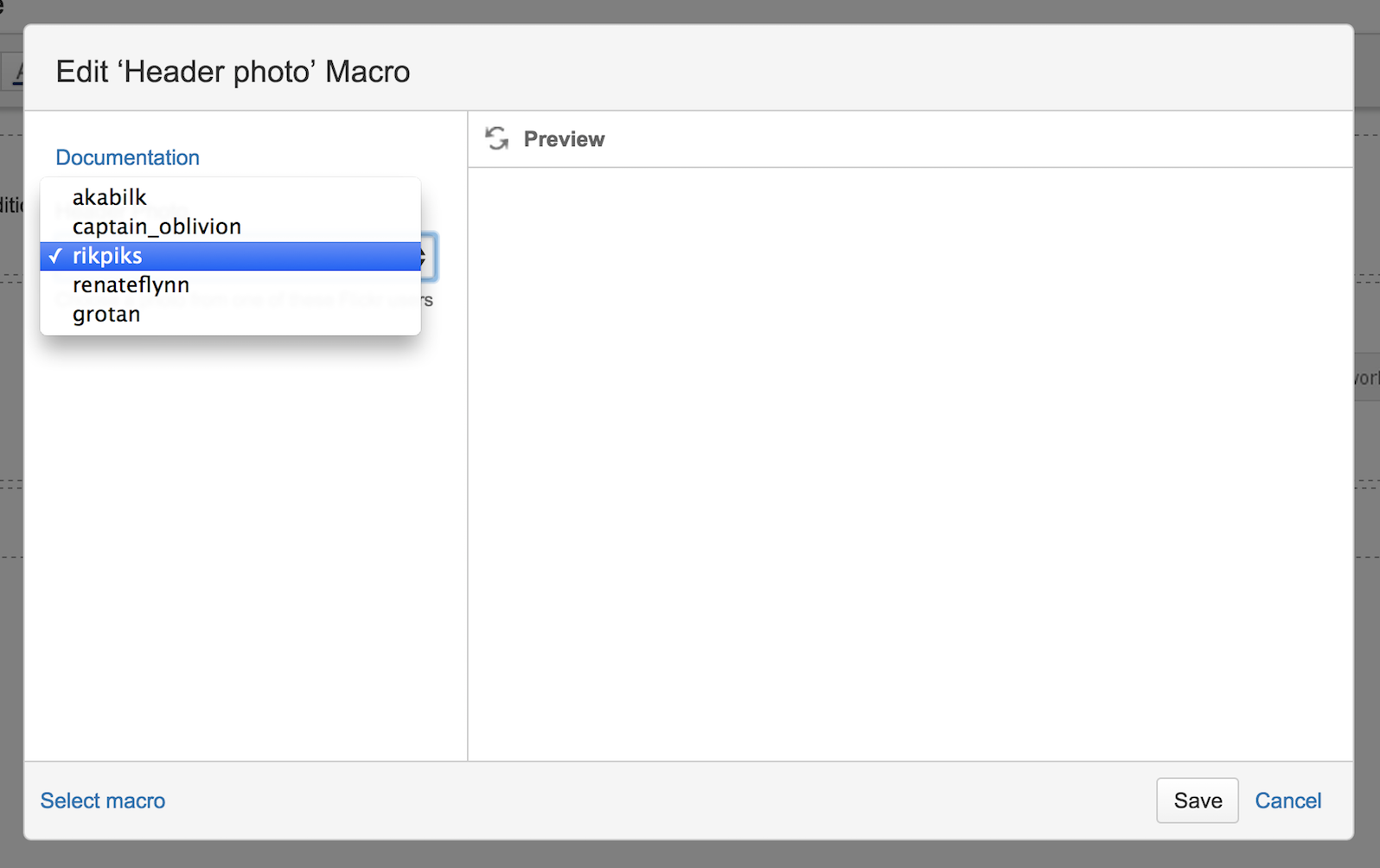
Here's the macro configuration screen:
The macro parameter values in the dropdown match the CSS classes in the custom global stylesheet. It's pretty straightforward.
I've really restricted the number of photos available here. This is just an example of how you could implement a feature like this. You could easily adapt this for custom photos on every space or every page if you really feel like it.
Perhaps random photos is the way forward for you? If so, you could do worse than placekitten.com.

