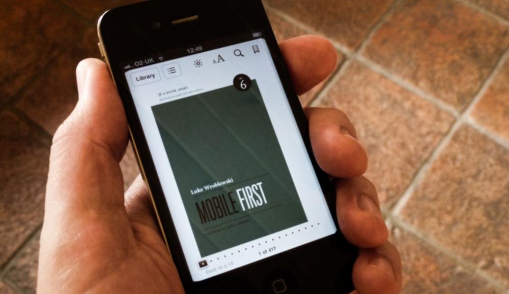
This is the second book by Luke Wroblewski that I've bought. His previous Web Form Design: Filling in the Blanks is a book that I'd still recommend to anyone who's likely to write a <form> tag. However the speed of change in browsing habits has been extraordinary since that book was published in 2008.
This leads us nicely onto his current book -- Mobile First. Elaborating on a very concise blogpost from November 2009, it is such a simple idea that almost anyone in your organisation can easily grasp (with minimal persuasion).
Embracing constraints (rather than fighting them) will ultimately get you to better designs
The rise of mobile has lead to very different usage patterns and this book succinctly documents the current state of affairs. For example, Luke describes mobile users' engagement with content on a mobile device as being --
one eyeball, one thumb
This forces you to remove distractions and simplify the interface to the task at hand -- even in distraction free environments, this is helpful.
He quotes usage data from Read it later showing when people are reading saved articles.
- Desktop - builds til noon & falls off after work
- Mobile - 4 peaks - breakfast, commute/start of work, end of work/commute, couch time/prime time/bed time
- iPad - small peak at breakfast, but mostly evening-bed time.
He firmly agrees with Rachel Hinman from Nokia's analogy --
the desktop is “diving” while mobile is "snorkeling"
My experience would also extent this to rock climbing vs. bouldering too.
There are sections on navigation; touch-target sizing; the familiar topic of form design (use smart defaults); input labeling (top aligned labels are good, labels within text fields sometimes not so); input masks; and responsive design.
I was particularly taken by the chapter on "Organization" (partially for the inclusion of a favourite xkcd comic). This aligns well with the positive changes I've noticed in successive versions of mobile applications (e.g. from LinkedIn or Facebook). The first generation of these applications started with a list or grid of navigation options. Subsequent versions of these companies apps emphasize content to be of primary importance so navigational options have become much smarter.
Reading this slender volume suggests that Luke really practices what he preaches. He has embraced the A Book Apart constraints and fitted so much that is currently so very relevant into such a small package.