I love Confluence. It's simple. It's easy to use. It's hierarchical, so you can build a nice structure.
But...
I hate Confluence. I can't find anything. Ever. It's hierarchical, but which branch in the hierarchy is my content located in? Damnit, the Lucene powered search doesn't seem to be able to find what I'm searching for.
My main gripe with Confluence is that by default it uses breadcrumb trails as primary navigation contrary to breadcrumbs best practices. They are no replacement for the real deal.
Breadcrumbs are secondary navigation designed as an alternative to the main navigational scheme. As such they give no context to relate the current page to others at the same level in the hierarchy. Breadcrumbs cannot aid in navigation within a level. So using breadcrumbs as primary navigation leads to a lack of awareness of the structure of the website/wiki space and thus confusion.
With this in mind, I decided to add a consistent primary navigational scheme to our global Confluence template. As Atlassian have in the past been known to change the templating scheme a little on upgrade to newer versions of Confluence, it is important to limit the changes to be as minimal as possible to limit ongoing templating maintenance issues.
Templating changes
These are limited to...
- Replace the main content div with a 2 column table based layout (I know, that's a somewhat naughty, but I'm a realist and in a hurry - Confluence already uses tables for some aspects of layout)
- Add a {pagetree} to the left hand column for primary navigation
- Replace a few icons in the {pagetree} macro to be a bit more Mac, a bit less Windows
- Add a custom/override stylesheet
I'm using the {pagetree} macro, but I'm not overly fond of it. Ideally, I'd like it to expand siblings and children of the current page by default. But again, I'm not interested in rolling my own navigational system. Rather I'll make do and mend what's available. It does an adequate job, but looks a bit ugly.
Edit Site Layouts | Page Layout
Find this content div:
<div id="content" class="page $!mode">

	...

	...

	...

</div>
Replace it with a table
<table id="myContent">

	<tr>

		<td class="myNavigation">$helper.renderConfluenceMacro("{pagetree:root=$space.homePage.title|startDepth=1}")</td>
		<td id="content" class="page $!mode">

			...

			...

			...

		</td>

	</tr>

</table>
I'm not proud of adding a table for layout, but it much less bad than the markup I've seen produced by some third party theme building plugins.
Global Stylesheet
Add a custom/override to the default stylesheet:
body {

	width: 90%;

	min-width: 750px;

	/*max-width: 1000px;*/

	margin:0 auto;

	height: 100%;

	background-color: #fff;

}

h1, h2 ,h3, h4 {

	font-family: Calibri, Arial, "Helvetica Neue", Helvetica, sans-serif;

	line-height: 1.25;

	margin: 0 0 .25em;

}

#header {

	margin: 0;

	padding: 3px 6px;

	background: #fff url(/images/my-images/backgrounds/menus/blue03.png) repeat-x;

}

#main {

	border: 0;

	padding-top: 30px;

}

#com-atlassian-confluence h1#title-heading img.space {

	margin-right: 10px;

	margin-left: 320px;

}

#myContent, #myContent  td {

	border-collapse:collapse;

}

#myContent, #myContent td td {

	border: 0;

}

#myContent {

	margin: -87px 0 0 0;

	background-color: #fff;

}

#myContent tr {

	vertical-align: top;

}

#myContent .myNavigation  {

	width: 270px;

	min-width: 270px;

	padding-top: 100px;

}

#myContent .myNavigation a {

	text-decoration: none;

}

#myContent .myNavigation ul ul {

	padding-left: 0;

	border-top: 1px solid #ccc;

}

#myContent .myNavigation ul ul ul {

	padding: 0;

	border: 0;

	margin: 10px -8px 0 -8px;

}

#myContent .myNavigation ul ul ul ul {

	margin: 0;

	padding: 0;

}

#myContent .myNavigation ul ul li {

	border-bottom: 1px solid #ccc;

	padding: 8px 8px 0 8px;

	background: #fff url(/images/my-images/backgrounds/menus/grey01.png) repeat-x;

}

#myContent .myNavigation ul ul ul li {

	border: 0;

	padding: 3px 8px 3px 20px;

	background-color: #ccc;

	background-image: none;

}

#myContent .myNavigation img {

	margin-right: 2px;

}

#myContent .myNavigation span img {

	display: none;

}

#myContent #content {

	padding: 100px 10px 10px 50px;

}

#myContent #content #editpageform {

	width: 100%;

}

#myContent #content .page-metadata {

	color: #999;

}

#myContent #content .wiki-content > .panelMacro {

	margin: 10px 0;

}

#footer {

	display: none;

}
Additional and replacement images
I've replaced the following images used by {pagetree}.
- /images/icons/tree_plus.gif
- /images/icons/tree_minus.gif
- /images/icons/tree_square.gif
This will have the side effect of making all {pagetree} icons more pleasing to look at.
I've added the following backgrounds:
- /images/my-images/backgrounds/menus/blue03.png (for the breadcrumb trail /search bar)
- /images/my-images/backgrounds/menus/grey01.png (for the primary/left-hand navigation)
Resulting Look and Feel
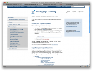
This is just a work-in-progress, but gives a marked improvement in usability due to the enhanced navigation.
